Role
Timeline
1 year
Brief
Redesign how users interact with their various marketing activities in the Cheetah Digital Marketing Suite by helping users focus on high priority tasks, but also how these fit into larger strategies. Give users insights into marketing campaigns and analytics across various applications within the platform so they can analyze data and take meaningful and timely action.
Goals
Design a new dashboard that helps marketers prioritize the right campaigns while also giving transparency into the company's overall marketing efforts.
Design a campaign organization tool that allows marketers to:
1. Manage touchpoints within customer journeys
2. Understand & monitor active/running campaigns
3. Edit triggers, actions, and conditions all in one intuitive interface
Where do we start?
Wireframes
After reaching consensus as a design team and with our stakeholders we started on wireframes. These varied in fidelity but helped us start to flesh out the various use cases and start figuring out gaps about how users moved inbetween different levels of execution and strategy on any given campaign.
Final Screens
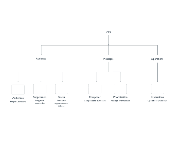
The following are screens for managing audience segments, compositions (campaigns), and some visualizations for campaign goals. You'll see the 2:1 ratio reused here. There is also a high emphasis on reused components and layouts when it comes to actions, selection, insights, etc.
Below are designs for our Campaign Planning / User Journey application. A frequent point of feedback from users when using customer journey applications was that they didn't always know what to do or how to get started. We wanted to alleviate those concerns by having templates that were clear and descriptive for users to help boost their confidence. Ideally these would also require minimal rework and further definition by users allowing them to activate journeys more quickly.
Reflection
Since this was more of a vision project a lot of this work never made it to production but there were many areas that we carved out as starting points to redesign strategic areas of the Marketing Suite. I think this was certainly a learning experience in working with stakeholders at multiple levels, managing expectations, and adapting to changing requirements (or lack thereof entirely). Ultimately I really enjoyed being able to work on something that was kind of blue sky but still anchored by real world use cases and personas and working to bring pieces and features into the Marketing Suite over time.
Check out another case study
Eat to Perform Fitness App
A fitness and wellness mobile app with a passionate monthly user base of 5,000+.
Staples' The HUB
The HUB is Staples' internal HR and intranet site serving 10,000+ associates across the company
Salesforce Email Creation Flow
Redesigned from the ground up Marketing Cloud's email creation workflow used by 10,000+ users every day.


