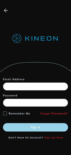
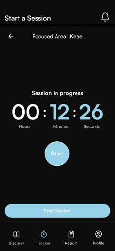
Existing Designs
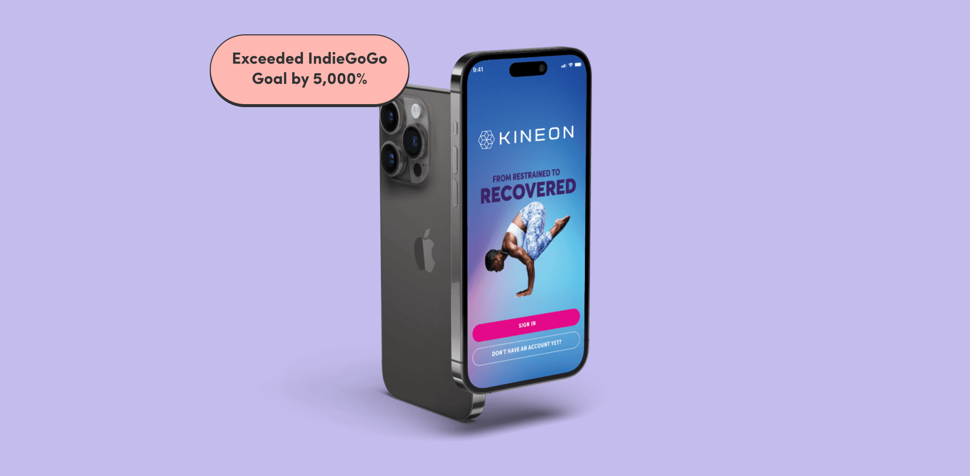
I was brought on to the project mid-flight to make sure we could meet their deadlines and deliver a finished product that would solve both their UX challenges for users as well as compete with other best-in-class apps in the health and wellness space.


How I Turned It Around
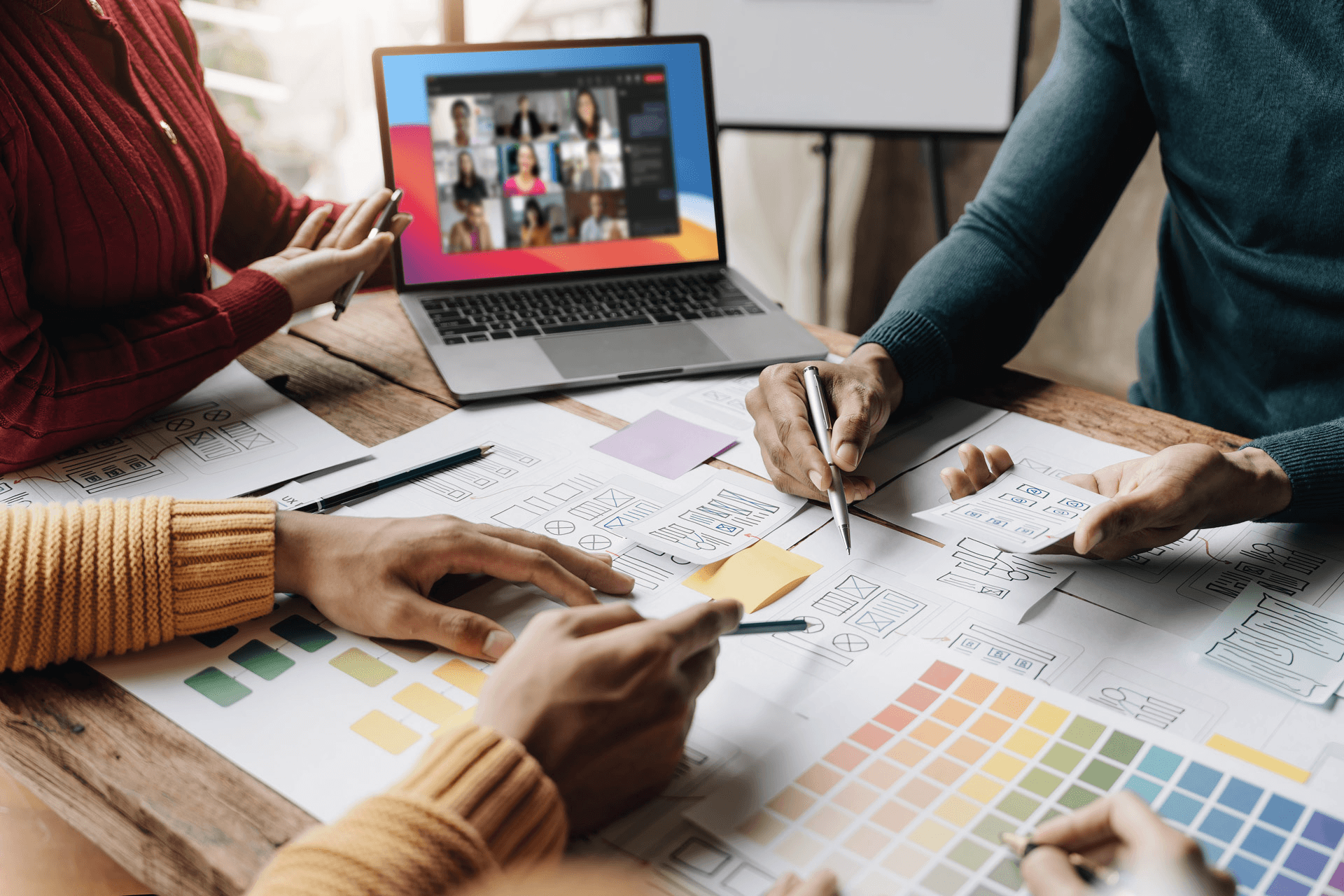
I held a series of rapid meetings and collaborations with internal and external stakeholders to understand current gaps, timelines, and limitations.
I also coordinated with their marketing team to make sure I understood their overall vision and aesthetic direction.
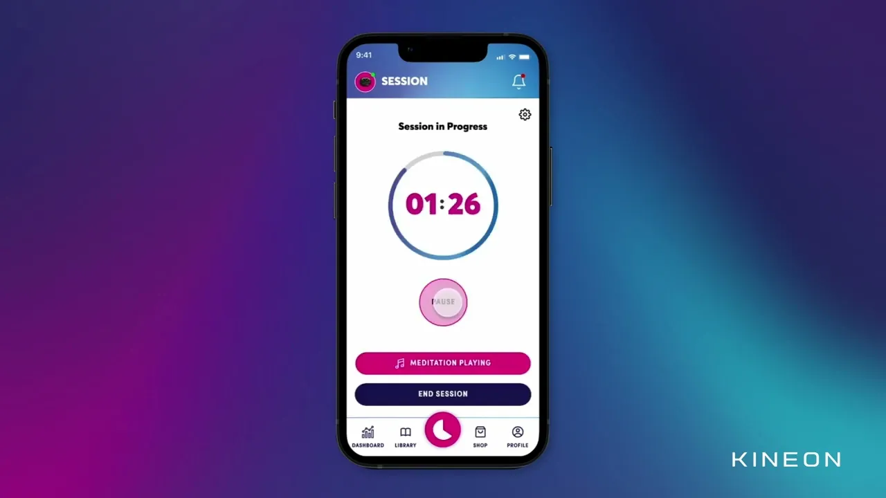
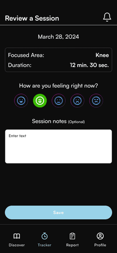
The Result
While the original app felt functional enough it certainly didn't feel inviting and up to the brand standards that the company strived for.
Not only that, but their personas could also sometimes be less technically savvy users so we wanted to make sure CTAs were clear and that copy was minimized to reduce cognitive load and friction.
What resulted was a cleaner experience that felt like something you wanted to engage with. We removed screens and transitions that felt unnatural or unnecessary and gave attention to the detail and craft of the app by adding animations, loading transitions, and more brand imagery.